Two-Page Spread: Format Plans/Drafts
Introduction. In this blog post, I will make three different plans/drafts for the layout of my two-page spread. I will describe my thought process while making them and why I made the choices I did for them. I will also either challenge, or follow the conventions typical of my genre, and explain which path I chose and why. There will be no original content such as images, titles/headings, or articles for now as the following layouts are just drafts that will later be chosen from for the final, at which point the original content will be inserted. These are just plans.


Draft #1
Layout
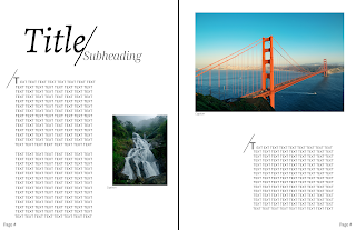
This draft is based on the following two-page spread from Travel magazine. The title is big and bold and, along with the subheading, they take up the whole width of the first page at the top. There are two paragraphs underneath them with a picture to the side. Another, larger picture, is at the top of the next page with a caption under it. There is another paragraph on the second page under the image. I added page numbers even though they are not in the reference spread because it will be hard to keep track of what page the reader is on if there are no page numbers. This layout in general is very easy to follow since people usually read from top left to bottom right. With this draft, people will be able to read everything in order, from the title to the last paragraph on the second page. I placed a byline at the bottom of the image to credit the author (me).
Fonts Used
As seen in the referenced layout, the title (overall location) is in a serif font. I chose to do the same not only because it further emulates the published layout, but also, as researched in Blog Post #2, "Font Psychology," serif fonts stand for intellect which helps drive the point home that the author, in this case me, knows what I am talking about, and that my information is trustworthy. I also made the subheading, which will be the more specific location I will be talking about, a serif font. This will create uniformity with the title, and it gives the same message that the following information on the pages is not misleading the reader. For the actual text, I followed the example spread and made it sans serif. Sans serif fonts are known to be friendly and it will help invite the reader to view everything on the pages. The captions for the pictures are also in a sans serif font but they are italicized. This is to set them apart from the actual article. The page numbers are in the same serif font as the page number on the Table of Contents page so they are consistent throughout.
Aspects of a Two-page Spread
Some typical aspects of a two-page spread are title, byline (name of author), and headings. In travel magazines, spreads also typically have multiple images on the pages. The title so far is "Title"and the heading in this case is the "Subheading." Since I will only be talking about one location, I do not need any other headings. My intention was to create my own version of the reference spread and there is no byline in this spread. Thus, I will also not be including a byline in this draft. This spread also does not have a pull quote, but it does have drop caps. Drop caps are the large letters at the beginning of the paragraphs. This is done to catch attention, and the line by them is a style choice to make it more aesthetically pleasing. I did both to follow the style and layout of the published spread. I followed conventions of my genre by having multiple images in my spread.
Colors Used
The only colors used in this draft are in the images. The published spread used only black for the text. This is so nothing is inconsistent and all over the place. The reader will not be overwhelmed by too many colors. Since I wanted to make my own version of the spread above, if I use this layout, my original article will be in black font, as well as the title, subheading, and captions.
Draft #2
Layout
This layout has a picture spread throughout the top two-thirds of both pages. This allows the viewer to see everything in it. There is also a smaller image in the bottom left of the first page. This is so that the entire lower part of the spread is not filled with text as that will be too much for the readers. There are also page numbers at the bottom of the pages. Instead of the usual "title in the top left part of the page" layout, I put it and the subheading close to the middle of the second page on the right. This was done because I wrote four paragraphs in total for my article and I needed space for them all. Since the title and subheading would not fit at the bottom with the rest and were not visible on the image on the left, I changed their position.
Fonts Used
I chose to make the title a serif font because serif fonts stand for intellect which helps the readers understand that I know what I am talking about and that everything I wrote is true. I also made the subheading, which will be the more specific location I will be talking about, a serif font. This will create uniformity with the title, and it gives the same message that the following information on the pages is not misleading the reader. For the actual text, I made it sans serif. Sans serif fonts are known to be friendly and it will help invite the reader to view everything on the pages. The captions for the pictures are also in a sans serif font but they are italicized to help distinguish them from the actual article. The page numbers are in the same serif font as the page number on the Table of Contents page so they are consistent throughout.
Aspects of a Two-page Spread
The title will be "Title" and the heading for the article will be "Subheading" for the sake of the drafts. I did add a byline in this draft unlike the first one because I was not following a specific layout this time and wanted to see how the spread looked with it present. No pull quotes or drop caps were included in this draft because I barely had space for all four paragraphs, and my space would have been even more limited if I did add them. To follow the conventions for two-page spreads in my genre, I included multiple images on the pages.
Colors Used
The only colors used in this draft are in the images. All of the text is black. This is so nothing is inconsistent and all over the place. The reader will not be overwhelmed by too many colors. If I had pull quotes or drop caps, I could have made them a different color, but I did not. Black is the color that is most easily seen and read on white so I kept the color of the article black.
Draft #3
Layout
This layout has only one picture which goes against typical conventions of two-page spreads in my genre. Professional, published magazines, have multiple images on their pages, as researched in Blog Post #1, "Codes and Conventions: Travel Magazines," but for this draft, I decided to try out only one picture that takes up all of the space on both pages. To allow for easy reading, the title, subheading, and byline are in the top left part of the first page. The article is separated into four paragraphs throughout the two pages. There is a drop cap in the very first paragraph and there are page numbers at the bottom of both pages of the spread.
Fonts Used
I chose to make the title and subheading a serif font because serif fonts stand for intellect which helps the readers understand that I know what I am talking about and that everything I wrote is true. I also made the subheading, which will be the more specific location I will be talking about, a serif font. This will create uniformity with the title, and it gives the same message that the following information on the pages is not misleading the reader. To add some creativity to the page, I italicized the title and subheading. For the actual text, I made it sans serif. Sans serif fonts are known to be friendly and it will help invite the reader to view everything on the pages. The page numbers are in the same serif font and size as the page number on the Table of Contents page so they are consistent throughout.
Aspects of a Two-page Spread
The title will be "Title" and the heading for the article will be "Subheading" for the sake of the drafts. I added a byline in this draft to credit the author and I could do that in this draft because there was space for it. There is only one drop cap in the first paragraph and this is done to draw attention to the beginning of the article. In this layout, I went against normal conventions for my genre and instead of including multiple pictures, I used only one that took up all of the space in the spread.
Colors Used
Unlike the previous two drafts, the color for the text in this draft is not black. It is all white instead. Due to the nature of the image used as a placeholder in the layout, black was not visible and easy to read. To solve this problem, I made the words white. Since there is a lot going on in the image already, I decided not to make the text colorful and made it a solid color so it is not overwhelming and easily legible.
Wrap Up
My first draft was my own version of an already published two-page spread in a travel magazine. It had two pictures and the layout contained enough space for three paragraphs. I will most likely not use this layout for my final spread as I wrote more than three paragraphs and I do not want it to look too crowded. The second draft contained two images: one taking up two-thirds of both pages, and the other taking up a little space in the corner. This followed travel magazine spread conventions which say to use multiple images. This layout had enough space for four paragraphs and I added a byline at the bottom of the larger picture. This would be a good choice for my final spread. My third, and final, draft has only one image in it. This purposely challenges the conventions of my genre. I wanted to try something new and see how it worked out. On top of the image, I put the title, subheading, and byline. Under them, I put a drop cap at the beginning of the first paragraph and then put in placeholders for four paragraphs. This layout also has enough space for everything I wrote, just like the second draft. I am leaning towards using either the second or third draft for my final depending on the quality of the pictures I get of my location and how many are of good quality.
Comments
Post a Comment