Two-Page Spread: Final Mockup and Elaboration
Introduction. In the previous blog post, I created three different drafts, or plans, for the layout of my two-page spread. In this post, I will choose one of the drafts and insert all of my original content into it. I will document the process I used to edit the images of my location that will be included in the spread, and the process I used to make the actual spread. Then, I will elaborate on why I made the choices I did for the final version.


I also put in my own title, subheading, and byline. Lastly, I put in a caption for the smaller image and then put in page numbers at the bottom of the pages.


Technology Used to Make Mockups
To make my cover drafts, I used Canva, a graphic design platform used to make documents, presentations, posters, and other visual content. This website/app includes templates for a variety of things for people to use.
Process for Making Mockups
First, I pulled up the layout I chose for my final spread. Then, I inserted the edited images I took of my location into the spread in place of the placeholders.
After that, I copy and pasted my article from the Google Docs sheet I typed it on and put it into the layout.
I also put in my own title, subheading, and byline. Lastly, I put in a caption for the smaller image and then put in page numbers at the bottom of the pages.
Technology Used to Edit Images
I used Adobe Lightroom to edit my pictures. Lightroom is a cloud-based service that gives you everything you need to create, edit, organize, store, and share your photos across any device. This app is free on my phone so it was easy to use.
General Process
I entered the app and added the image I wanted to edit from my camera roll into the "library" section. After clicking the picture, I went to the different categories of editing and used the more specific tools to change the picture.
Editing Images
Image #1
I decreased the "Exposure" to -0.54 and increased he "Contrast" to 36 to defined the differences between the dark and light parts of the image. This was also heightened when I made the "Highlights" 23 and the "Shadows" 100. By also changing the "Whites" and "Blacks," I was able to make the night sky around the mosque darker which helps bring and keep attention on the mosque and its lights.
I made the "Temperature" and "Tint" opposites of each other by making one -15 and the other 15. I wanted to make the image look like it is leaning more towards the cooler spectrum of the color wheel (blue, green, and purple), so I can increase the effect of the lights already on inside the mosque. To make the colors of the building itself brighter and more pronounced, I increased the "Vibrance" to 20 and the "Saturation" to 45.
I wanted to make the details of the building stand out more, so I made the "Texture" 19. I also wanted to make the picture clearer and easier to see so I changed the "Clarity" to 50 and the "Dehaze" slider to 55. Since I did not want the cars at the bottom corners of the picture to be seen too much, I decreased the "Vignette" to -24. This added a shadow, or hazy effect to the corners of the image.
This screenshot is almost the same as the one directly before it. However, one thing is different. The "Clarity" in the first image is set to 50, whereas here, it is at -3. The second image shows how I originally edited the picture in this category. I chose to change it from -3 to 50 because when I put the edited image into the spread, it was very blurry and hazy. To make it look a little better, I increased the clarity and did not keep this edit.
Image #2
To define the disparities between the dark and light sections of the image, I reduced the "Exposure" to -0.54 and increased the "Contrast" to 36. When I made the "Highlights" 23 and the "Shadows" 100, this was amplified. I was able to darken the night sky around the mosque by shifting the "Whites" and "Blacks," which helped draw and maintain focus on the mosque and its lights.
By making one -15 and the other 15, I made the "Temperature" and "Tint" opposites of each other. I intended to make the image appear to be leaning toward the cooler spectrum of the color wheel (blue, green, and purple) so that the effect of the lights already on inside the mosque could be amplified. I increased the "Vibrance" to 20 and the "Saturation" to 45 to make the colors of the structure itself brighter and more prominent.
I wanted the building's intricacies to stand out more, so I created the "Texture" 19. I also set the "Clarity" slider to 50 and the "Dehaze" slider to 55 to make the image crisper and easier to view. I reduced the "Vignette" to -24 since I didn't want the cars in the lower corners of the image to be overly visible. The corners of the image were given a shadow or fuzzy effect as a result of this.
I did not use this image as it was not cropping and adjusting the way I wanted it to for my final spread. It looked strange when I stretched it out to fill the whole space the main image was supposed to take, so I used the first image because it had more room for me to use.
Image #3
I increased the "Exposure" to 0.40 and the "Contrast" to 25 to establish the contrasts between the dark and light areas of the image. This was enhanced when I set the "Highlights" to -30 and the "Shadows" to -100. By adjusting the "Whites" and "Blacks," I was able to darken the night sky around the mosque, which helped pull and retain emphasis on the building and its lights.
The "Temperature" is a 5 and the "Tint" is a 15. I wanted the image to tilt toward the warmer spectrum of the color wheel (red, orange, and yellow) so that the effect of the lights against the orange of the mosque could be emphasized. To make the colors of the structure itself brighter and more noticeable, I increased the "Vibrance" to 35 and the "Saturation" to 10.
I made the "Texture" 20 to make the building's intricate details pop out more. I also set the "Vignette" to -50 because I didn't want the cars in the image's lower corners to be too noticeable. As a result, the image's corners were given a shadow or fuzzy look.
Image #4
To produce contrasts between the dark and light regions of the image, I adjusted the "Exposure" to 0.434 and the "Contrast" to 50. Setting the "Highlights" to -60 and the "Shadows" to -34 improved this. I was able to darken the night sky around the mosque by altering the "Whites" and "Blacks," which helped pull and retain emphasis on the structure and its lights.
I set the "Temperature" to -40 degrees and the "Tint" to ten. I wanted the image to tilt toward the cooler spectrum of the color wheel (blue, green, and purple) so that the effect of the lights on the water in the fountains could be emphasized. To make the colors of the structure itself brighter and more noticeable, I increased the "Vibrance" to 35 and the "Saturation" to 45.
I used the "Texture" 40 to draw attention to the building's unique details.
Final Two-Page Spread
Layout
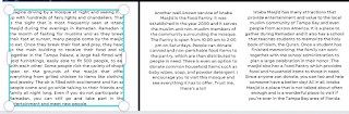
This layout has a picture spread throughout the top two-thirds of both pages. This allows the viewer to see everything in it. There is also a smaller image in the bottom left of the first page. This is so that the entire lower part of the spread is not filled with text as that will be too much for the readers. The draft for this spread in Blog Post #14 "Two-Page Spread: Format Plas/Drafts," only had one smaller picture. In the final, I have two because I underestimated how much space I had left after shortening my article to from four to three paragraphs, and I did not want to have too much white space. There are also page numbers at the bottom of the pages. Instead of the usual "title in the top left part of the page" layout, I put it and the subheading close to the middle of the second page on the right. This was done because I originally wrote four paragraphs in total for my article and I needed space for them all. Once I put it in, however, I found that I did not have enough space, so I cut one of my paragraphs out. Since the title and subheading would not fit at the bottom with the rest, I changed their position.
Fonts Used
I chose to make the title a serif font because serif fonts stand for intellect which helps the readers understand that I know what I am talking about and that everything I wrote is true. I also made the subheading, "Tampa, Florida," a serif font. This will create uniformity with the title, and it gives the same message that the following information on the pages is not misleading the reader. For the actual text, I made it Garet, a sans serif font. Sans serif fonts are known to be friendly and it will help invite the reader to view everything on the pages. The caption for the picture is also in a sans serif font but it is a different one from the article font, Garet, to help distinguish them from the actual article. The page numbers are in the same serif font, Droid Serif, as the page number on the Table of Contents page so they are consistent throughout.
Aspects of a Two-Page Spread
The title will be "Istaba Masjid" and the heading for the article will be "Tampa, Florida." I was going to switch them, but I decided to put them in the order they are in now because the title needs to catch attention, and I thought one way to do that would be to put the name of the specific location I am writing about as the title. My byline in the spread at the bottom right corner of the main picture, is just my name. I looked at some travel magazines and they did not have bylines most of the time, so I did not know the official way to put it. I went against conventions (travel magazines do not usually have bylines) because I wanted to give myself credit for the effort it took to writ everything as well as make the whole spread. No pull quotes or drop caps were included in this draft because I barely had space for the article to fit and my space would have been even more limited if I did add them. To follow the conventions for two-page spreads in my genre, I included multiple images on the pages.
Colors Used
The only colors used in this draft are in the images. All of the text is black. This is so nothing is inconsistent and all over the place. The reader will not be overwhelmed by too many colors. If I had pull quotes or drop caps, I could have made them a different color, but I do not. Black is the color that is most easily seen and read on white so I kept the color of the article black.
Wrap Up
In this blog post, I chose one of three layout plans for my two-page spread that I made in Blog Post #14, "Two-Page Spread: Format Plans/Drafts." I chose the second layout because it gave me a lot of space for my article and it also used multiple images which follows the conventions of spreads in my genre (travel magazine spreads include many pictures). I edited my pictures using Adobe Lightroom and then I used Canva to put in all of my original content into the layout. In the end, I had three images total, and three paragraphs, since I shortened my article from four paragraphs to three. One of my images has a caption informing people what it is depicting, who took it, and when it was taken. My title and subheading are in the top right corner of the second page in the spread because I did not have space with the rest of the article and because they got rid of some of the blank space in the image they are placed on. The byline, which consists only of my name, is also on the largest image, but in the bottom right corner. I also put page numbers at the bottom of both pages.
Comments
Post a Comment