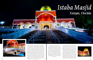
Two-Page Spread Feedback and Final Revisions
Introduction. After making the two-page spread, I showed it to my classmates to receive feedback on what I can improve, and what I should keep. They liked the images, layout, and color scheme, and the fonts. They gave me some tips to help me improve the rest.
Feedback Received:
- Align all of the paragraphs the same way
- Make the font size for the article bigger for better readability
- Make the main image less blurry
Original Two-Page Spread
Trying out Advice:
I tried out the first piece of feedback I was given, which was to align the paragraphs the same way. I did notice before that they did not look the same, but for some reason, I never thought of the alignment as being the problem. Changing it so they are all justified on both sides makes it look more professional and neat. I am going to keep this change because it looks better, and because it connects to the usual conventions of text in two-page spreads in my genre, which is that most articles are justified on both sides.
The third piece of feedback I received was to make the main image less blurry. That was my intention in the first place, but since I had to enlarge the picture to fit the two-page spread, the subject of the image also stretched. This caused it to become a little hazy. I tried to fix the problem by stretching the image a little less, and I thought it would work since I also made the size of the main image smaller, using the previous feedback. I think it is still a little blurry, but it is better than before.
Final Two-Page Spread
Revisions Made/Wrap Up
I decided to keep the feedback my peers have given me. Changes such as aligning all of the paragraphs the same way (justified on both sides), making the font size of the article bigger, and making the main image less blurry. These helped improve my two-page spread by making the article look more neat and put together and easier to read. This also helped me connect more to the conventions of articles in two-page spreads in travel magazines, in that most articles are justified on both sides. They also helped make the main image less blurry and more professional looking. I also decided to take out a few sentences from the first and third paragraph to make the sizes of the paragraphs more similar to each other.

.png)


.png)
Comments
Post a Comment