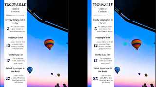
TOC Feedback and Final Revisions
Introduction. After making the TOC page, I showed it to my classmates to receive feedback on what I can improve, and what I should keep. They liked the image, layout, and color scheme, and they gave me some tips to help me improve the rest.
Feedback Received:
- Changing the font of "Trouvaille" to a sans serif font
- The font for the numbers should be modern and a serif font for the article titles would go better with the rest
- Make the descriptions smaller than the article headings
- Add a page number at the bottom of the TOC page
Trying out Advice:
I changed the font for "Trouvaille" to be a sans serif font (Sukar). The person who gave me this feedback gave this advice thinking that it would go with the other fonts better. It does not. The title is supposed to look apart from the rest of the text to show its significance, but not too separated that it looks weird with everything else. This change also does not follow the conventions of a travel magazine table of contents page. I will not be keeping this change to the title's font.
I made the font for the page numbers a more modern font (Oswald) and made the font for the article titles a serif font (Tropikal). The modern font for the numbers do not follow the conventions of my genre and they do not go with the rest of the fonts, so I will not be keeping them. The serif font for the headings, however, do go with everything else on the page, and makes it look more unified. I also made the titles closer to the descriptions so that people would not get confused as to which heading goes with which description. I will be keeping the serif font and the new spacing for my final TOC page.
I added a page number to the bottom of the page. A classmate advised me to do this so it is easier for readers to keep track of where they are and where they can find other content. This also makes sense since this is the whole point of a table of contents; to tell people what content is on what page, and without page numbers they would not be able to find what they want to see/read. I am keeping this change to the page.
Final Table of Contents Page
Revisions Made/Wrap Up
I decided to keep some of the feedback my peers have given me. Changes such as adding a page number to the bottom of the page, lessening the space between the headings and descriptions, and making the font for the article titles serif. Making the font serif makes it look more unified with the other types of fonts on the page and emphasizes the headings' importance as titles, not descriptions. It also follows the conventions of table of contents pages in travel magazines, as mentioned in Blog Post #9 "TOC Genre Analysis and Plans." Making the headings closer to the descriptions lowered the chances of someone getting confused as to what title goes with which description. Adding a page number to the bottom helps people keep track of what page they are on and where the content is by looking at the table of contents. I will put page numbers at the bottom of my two-page spread as well.


Comments
Post a Comment